Eeeeek! It’s here! It finally happened!
My new website is live and ready for your eyes to take in!
This was my first experience with re-branding my photography business. I went for the whole kit and kaboodle – new logo, business colors, website, and blog. My whole business image has been transformed to what I have been envisioning for quite a while.
In the past I have always hired a graphic designer to design my logo. But I have always designed my own website and blog. Everytime I designed my blog or website myself, it wasn’t quite right. I could never put my finger on it, but I knew part of the reason why, was because I am not a graphic designer. So after much contemplation, I decided to take a leap of faith and dive head first into the re-branding process.
I did quite a bit of research on graphic designers. I knew I wanted someone local to Minnesota, and I knew I wanted someone who could handle my OCD-ness. You see, it’s hard to hand over your thoughts and inspirations to a complete stranger and hope they interpret them correctly. I decided to hire Rhonda Stark Design. After I chatted with her on the phone I knew we would work well together. It’s very scary to trust that the person you hire will do exactly what you think you want. But at the same time it’s very freeing to watch your new brand take life and allow your designer to take control.
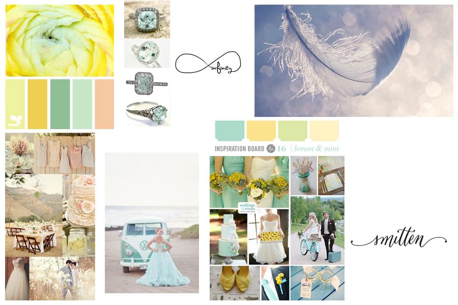
First I put together an Inspiration Board on my Pinterest page. I knew I wanted mint as one of my main colors. Since my old branding always had yellow, I thought I would add yellow as one of my new colors too (as you can see below). I also wanted a light, ethereal feel to my new site as well as a bit of whimsy. The infinity symbol was very important to me, and I knew I wanted it incorporated into my new logo.

Rhonda was amazing to work with. She listened to my OCD-ness and ran with it. When there was something that she knew wouldn’t work, she told me. I really appreciated her honesty. So after a few rough drafts she came up with my amazing new logo! I am just in love with it!

After the logo was finished, we were able to move forward by designing the new website. After a few rough drafts I decided to scrap the yellow color. It was just too light. I knew I wanted to keep the mint. I love the freshness of it. So I asked if I could see the website with a coral color instead. It instantly spoke to me! It really emphasizes the ethereal feel that I wanted in the beginning. After that it felt like smooth sailing (although my designer might disagree with you!).
This whole process has been so invigorating. I feel transformed and reawakened!
Please come in and stay a bit. Look around and let me know what you think!
xoxo,
Nicole
www.nicolespanglerphotography.com
nicole@nicolespanglerphotography.com
www.facebook.com/nicolespanglerphoto
763.220.0705
